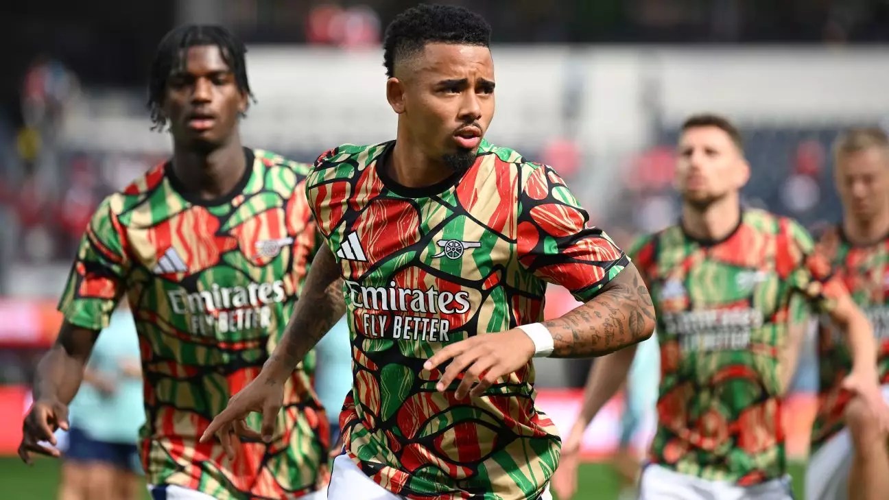
Football clubs across Europe not only focus on the design of their playing jerseys but also on the pre-match apparel worn by their players and staff. While match-worn shirts tend to stick to traditional club colors, warm-up kits provide designers with an opportunity to showcase their creativity and make bold statements through unique designs.
Milan’s warmup kit for this season stands out with its off-white tone and golden pattern, resembling a freshly raked golf bunker. The design is a refreshing departure from traditional club colors and showcases the potential for creativity in warm-up attire.
Ajax’s warmup top features an intricate pattern inspired by the three X’s on Amsterdam’s official flag, representing the crosses of Saint Andrew. While the historical inspiration adds depth to the design, it may not resonate with all fans, particularly those more interested in modern aesthetics.
Arsenal’s warmup kit draws on African heritage themes, continuing a trend seen in their previous away kit designs. The bold and over-the-top approach may polarize opinions, with some seeing it as a successful homage to cultural roots and others finding it excessive.
Barça’s dark and dusky blue warmup kit incorporates gold trim and a club crest graphic, creating a sophisticated look. However, the “envelope” neckline may be a point of contention, as it deviates from standard sports apparel design and may not appeal to all fans.
Chelsea’s “molten metal” warmup kit concept embraces a scattergun graphic design that aims to captivate viewers. While the bold approach may be divisive, it demonstrates the club’s willingness to push boundaries and experiment with unconventional patterns.
Juventus opts for a celestial theme in their warmup kit, featuring a lunar eclipse pattern that adds a unique twist to the traditional club colors. The design may appeal to fans looking for a more abstract and artistic interpretation of the team’s identity.
Liverpool’s warmup shirt takes a minimalist approach, featuring an all-over crest graphic on a red fabric with vibrant yellow trim. The simplicity of the design combined with traditional club colors reflects a classic and timeless aesthetic.
Real Madrid’s warmup shirt exudes retro vibes with a stripped-down interpretation of their home colors and a star-shaped graphic. The design channels a nostalgic feel reminiscent of past football kits, appealing to fans seeking a vintage aesthetic.
Newcastle’s warmup shirt takes a modern approach, drawing inspiration from their nickname “The Magpies” to create a unique feather pattern. The black-and-white color scheme and creative design set this kit apart from more traditional offerings.
Football warmup kit designs in Europe range from the sublime to the ridiculous, showcasing a diverse array of creative concepts and styles. While some designs successfully push boundaries and capture the essence of the clubs they represent, others may miss the mark and fail to resonate with fans. Ultimately, the world of football apparel design continues to evolve, offering endless possibilities for innovation and self-expression.


Leave a Reply